
It comes from a brand new report from Health and Human Services, which summarizes what we know, so far, about the cost of health insurance under the Affordable Care Act.
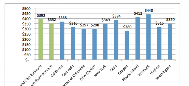
What you’re looking at here shows what insurance plans will charge for coverage that will cover 70 percent of a typical subscriber’s health-care costs. These are averages of the second-lowest cost plans that provide this level of coverage (silver plans, as they’re known under the health-care law):
What’s striking, to me at least, is that premiums look relatively similar despite wildly different rhetoric across the country. California and Ohio might be the best examples of this. When California announced its rates, the Democrat-led state celebrated how affordable prices came in. When Ohio released data, it derided how expensive health insurance would be under the federal reforms.
In actuality though, Ohioans and Californians will see pretty similar premiums on the new marketplaces. There’s a $16 difference between the two states.
One other important thing to keep in mind: These are the prices before federal tax subsidies, which will go out to many Americans between 138 and 400 percent of the federal poverty line (about $15,000 to $45,000 for an individual). These are, essentially, the maximum prices for people who earn above that threshold. Below the threshold, many will get a significant discount on these rates.
Read the full report from HHS on premiums under Obamacare right here.